Today I’m going to introduce you to The Worst Facebook Page In The World. If you’re sitting there right now thinking, “Uh oh, I hope it’s not my page” then don’t worry. I made this page myself just to illustrate some social media failings.
Over the next few weeks, I’m going to go through The Worst Facebook Page In The World, section by section, to show you common social media mistakes and how to overcome them by using the correct practices.
This week, I’m going to focus on the profile photo and cover image.
Let’s take a look:
Now you know what they say; you only get one chance to make a first impression and straight away my first impression of the page is, “BLEURGH”.
Facebook Profile Pictures
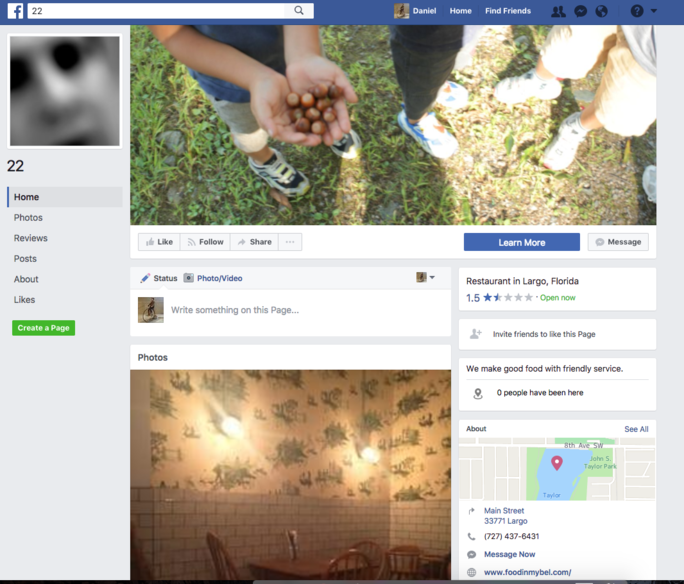
When any new person comes to a Facebook page, the first thing that they’ll see is your cover image and profile picture. So if they stink, your whole page stinks! Immediately we can see the issue with the page.
For starters, their profile photo has nothing to do with the business. (We can’t even tell if they are a business!) It’s a blurry, out of focus shot of somebody’s face. Maybe it’s the owner? Who knows.
The quality of the photo is an issue, but even more of an issue is the content. A business can live or die based on its branding, and it seems this business has no logo. Or an owner that didn’t think to place their logo on their website.
What about some good examples, though? Well, what do you know! The Go! Agency has a perfect profile picture.

We’ve chosen to use our logo as it pops out on the page and is well connected to our brand. The great thing about using your logo as a profile picture is that it will get peppered around your page, but also on other pages when you leave a comment, or somebody shares one of your posts. A good logo will pop out from the page and be instantly recognizable.
Facebook Cover Images
Next up we have the cover image.
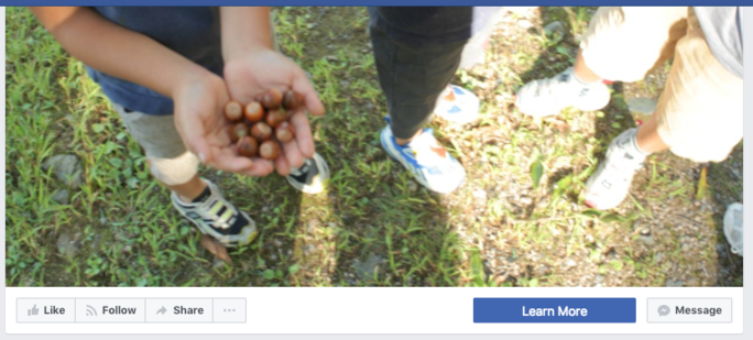
Having a branded, clear cover image is important just for the simple fact that it takes up 1/3rd of a visitor’s screen. Think of it as a virtual store front.
In this case, the owner has decided to put up a random photo of feet and hands, which tells us nothing. It doesn’t inform visitors of what the business is, it doesn’t stir any emotions and worst of all, the photo is blurry and bad quality. Going back to that idea of the store front – how would a customer react in real life if this was plastered over the store window? Probably with bewilderment.
By this point, I’d imagine a good amount of visitors would have left the Facebook page. Two terrible photos are all it takes sometimes. We’re often told to “Never judge a book by its cover, ” but we all do it.
In this case, most people would judge that this business doesn’t care too much about their Facebook page, which kind of leads us to assume they don’t care about their business either. It doesn’t make you believe in them as a legitimate business.
The most annoying thing about this is that this first impression relayed no information about the business at all. None. Can you tell me what the business even does? It’s impossible to tell at first glance, which is how new visitors would feel.
Now here’s a cover image used by one of our clients:

It hits the mark well because it instantly tells the visitor what this business does, where it’s located and also features a relevant photo that puts forward positive emotions. Most important of all though, it looks good. (Probably because we had our graphic designer make it…)
You’re probably thinking, “Well duh! We’re not that stupid.” But we’ve seen these basic rules broken time and again. Sometimes you just don’t know what you don’t know!
In my next post about the World’s Worst Facebook Page, I’ll be showing you why it’s important to keep your page up-to-date and some good practices for dealing with negative reviews.
Until then, you can sign up for our newsletter below!