In our last post in the At The Drawing Board series, we learned how to create a saved Facebook audience. Now you’re probably thinking, “Finally, we’ve got our audience so we can create our ads! Woohoo!”
You could definitely do that, but you may be making a massive mistake.
Why?
Well think about this, where is your Facebook Ad going to send your audience?
Many people focus on their ad, never considering the next step in the journey. You can have the best Facebook ad in the world, but if it leads to an irrelevant page on your website, then you’re wasting your money.
To ensure your ads are successful, you need to make sure the pages they’re pointing to are well designed and help you to reach your goals. That’s where landing pages come in.
What Is A Landing Page?
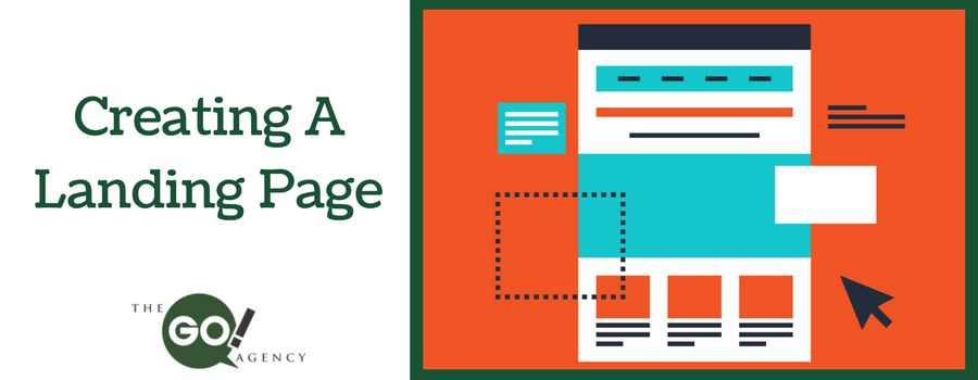
In basic terms, a landing page is a page that visitors arrive on when they first come to your website. Since it’s possible that a visitor could arrive on any page of your website, you could say that every page is a landing page (which is why website design is so important.)
In the case of Facebook Ads, a landing page will be the page on your website which you are going to send people to once they click the ad.
Now you could send people to the homepage of your website, but that wouldn’t help you to fulfill your goals. So your landing page should be a custom page designed to help ad clickers towards a marketing goal.
For example:
Your goal may be to sell a new type of tennis racket. Your Facebook Ad will make your audience aware of the product and entice them to click. From there they’ll come to a page on your website with the intention of them buying the tennis racket.
In our case, our goal is to get people to sign up to our mailing list so our landing page will be designed with that in mind.
Landing Page Tips
So where do you start when it comes to creating a landing page? Here are a few tips!
Have a clear goal in mind
If you don’t have a goal, you’re getting way ahead of yourself. Come up with your marketing strategy first.
Your goal is the purpose of your landing page and ads and has to be clear to the user. Is it to download your ebook? Buy your product? Or to sign-up to your mailing list?
Regardless, make sure there is a clear call to action. No need to be subtle. Make sure it stands out, a colorful button works best. Hitting the user over the head with a giant button that says, “ADD TO CART” is way more effective than being vague.
Keep it simple
Everything on a landing page should have a purpose. It should convince the user to complete your call to action. When you think your page is complete, go through each element and ask “How does this help the user towards my call-to-action.” If it doesn’t help at all, remove it.
With that in mind, your landing pages should be much simpler than your website pages.
Use an offer
The best way to encourage a user to complete your call-to-action is to tie an offer to it. The better the offer, the more likely they’ll be to take you up on it. Time sensitive offers can also add a bit of pressure to complete the CTA right that moment.
An offer of money off an order or even an ebook is a great way to get users to convert.
Check your Landing Page before you let it out in the wild
It goes without saying that you should proofread your landing page before you start sending users to it. But something that is often missed is checking the landing page on both a desktop PC, tablet and a mobile phone.
The page will look different depending on how your users are arriving, so you want to ensure nothing is getting in the way of them completing their call to action. With most people now using their mobile phone for Facebook and using the internet, you need to make sure your landing page looks fine on a mobile.
With these tips in mind, your landing page should be a success and you’ll finally have something which you can send people to once they click your ads.
If you need some help with your landing pages, contact us now, and we can help!


