It’s not a shocker that the world of marketing and sales is shifting quickly to going completely digital. Many of us have embraced going digital for years and do constant audits of our online presence. But for those companies who are deciding to begin to invest more time and money into their online presence – there can be more work than meets the eye when it comes to a smooth transition.
Namely – what is going on with your website?
Why is the copyright at the bottom of the page say 2012?
Why does your newsletter link go to a 404 Error page?
Why do you still have your defunct Google+ profile link in your website header?
Needless to say, if you haven’t updated or refreshed their website in forever….you need to do it NOW. Especially if you need to create a website from scratch (in that case, it might be time to look into web hosting services). Time is of the essence and the time is now!
A website refresh is essentially taking the existing structure of your website, and sprucing it up; giving it a facelift. Part of it can be packing it full of keywords (for SEO), but it can also be adding in new copy, graphics, incentives, colors, fonts, and more.
Maybe it’s adding a welcome video or a new slider on your homepage that will entice your visitors. Maybe it’s adding a chat box so visitors can easily get their questions answered.
Or maybe it’s adding in all of these elements for a complete overhaul. Whatever you choose to do, your website should be up-to-date and ready to go so that you can market your products or services the right way and have a strong online presence. But where do you start? Here are the basics:
Whether you have an existing website or not, you first need to sit down and brainstorm what you want your ideal website to look like. Are you hoping to do a complete rebrand? Visually what needs a change?
What about your menu options on your web page? These are just some of the things that need to be taken into consideration when thinking about your overall website design. Take some time to go through your website to see what’s working and what isn’t.
Tip: For those of you who want to add interest to your homepage, include pop-ups with incentives that will draw your website visitors in. These could include a free download or even a percentage off when they sign up via their email. Just be cautious that these aren’t too aggressive, and end up being a nuisance to your audience – if someone has to continuously click off the popup, they’re going to end up leaving your site annoyed.
Also, you’ll need a checklist of what to include when it comes to creating or maintaining a professional website. Here are some starter points on what to:
- Include a custom domain.
If you do not have a custom domain name, this should be one of the first things on your list. Your URL should be simple and easy, so you may want to go with your business’s name so that it is easy to access for both new and old website visitors.
- Add Calls To Action (CTAs).
How many times have you visited a website and signed up for a discount or downloaded a free ebook? Many of us have stayed longer on a website because of the strong and clear calls to action. The good thing is, your competition isn’t the only one who can do this; you can too.
Utilize popups (but not too many) on your website so that when visitors arrive, they are likely to engage on your website instead of bouncing within a couple of minutes.
- Add links to your social media sites.
If your social media sites are not on your website, how do you expect your visitors to connect with you? These should be very visible and placed either at the top or bottom of your web page. Ensure that these links are not broken and that all of them are linked to the correct social media channels. And…make sure the links work after you add them.
- Add a contact form.
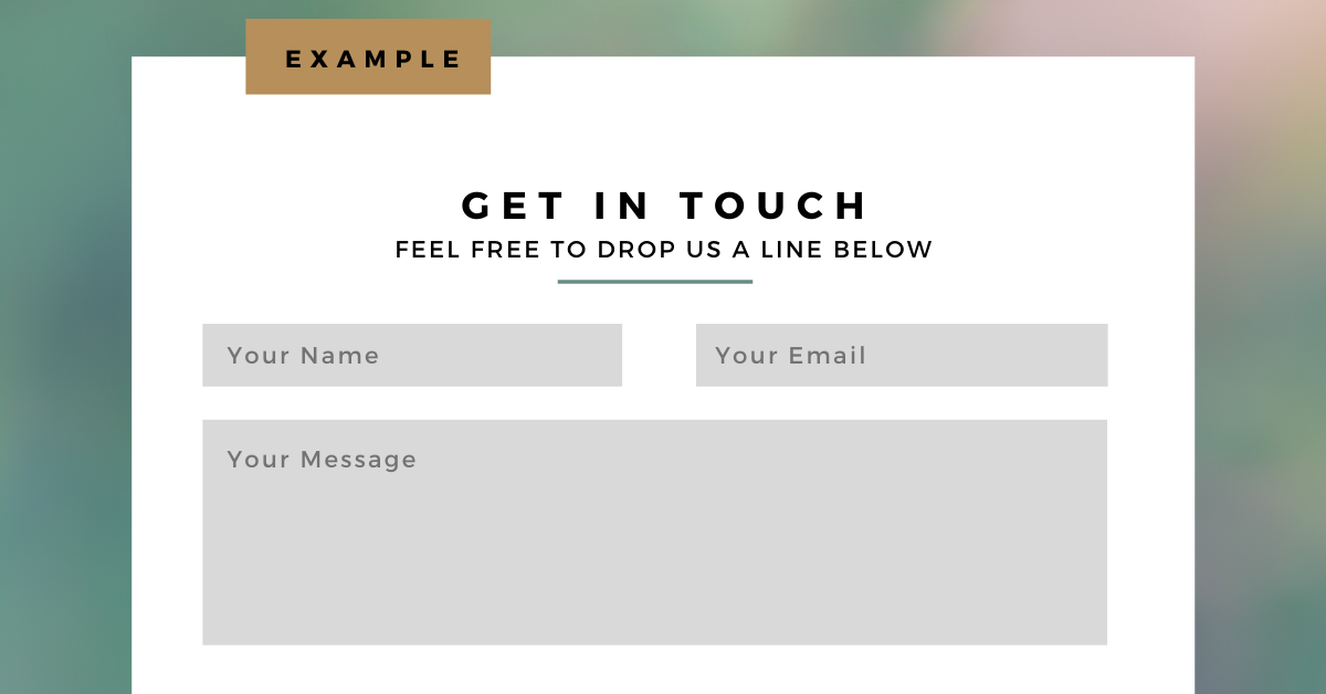
While many website visitors may be interested in calling your business or contacting you through social media, many of them may want to simply fill out a “contact us” form where they fill out their name, email, and ask specific questions. When this is on your website, make sure that it is connected to an email address that you have access to and are constantly using. This will ensure that no question goes unnoticed.
- Add a place to sign up for your email newsletter.
Email marketing is a big focus for many businesses. If it is for yours, and you are wondering how you can attain more subscribers, you have to make sure that it’s easy for new people to subscribe. You don’t want them to jump through hoops!
One of the reasons why you might not be getting more is because no one knows where they can subscribe. Fix this by adding a newsletter signup form to your website. This can either have its own page or section of the website, or you can include it in a popup.
For example, as soon as visitors open the homepage of your website, a popup would appear offering them a 10% discount in exchange for signing up for your newsletter. Another bonus to this is that it can help decrease your bounce rate.
Don’t worry if you have a signup form on every page. Not everyone will look through your website the same way, so have all of your bases covered.
- Add a page with your contact information.
People need to be able to see where you are located and contact you easily. Also, make sure that all of this information is accurate and up-to-date. For example, if you have recently moved locations, it is important to let visitors know where your new brick and mortar establishment is.
Have more than one location? Make sure it is listed. Possibly add a Google Map plugin so people can get directions if your customers visit your business.
- Ensure your site is responsive.
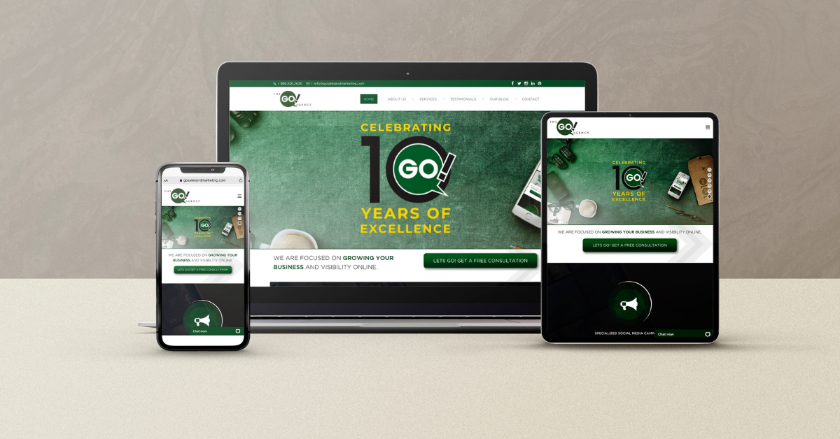
Does your website look completely different depending on the device you view it on? Your web design needs to be consistent. Make sure you test it to see what it looks like on a desktop vs. a laptop, and a tablet vs. a smartphone. Make sure that your images are sized correctly and that all of the features are working across the board.
In addition, if visitors are able to purchase products or services from your website, you need to check and see that everything is working well in your online store. For example, see if there are any glitches in the checkout process and if coupon codes can be used.
Top Tip: If you are having your website designed internally or externally, always audit the work when it is done on a desktop/laptop computer, mobile phone, AND tablet.
- Update your visuals.
Graphic design is another vital element to your website. If you currently have old product images on your website or images of products that are no longer being sold, it is time to make some updates with new, high-quality images. Incorporate new design elements as well with tools such as Canva to make things interesting. If you are using stock photography – you might want to look at your competitors websites quickly. You will be surprised at home many people in your industry are using the exact same stock photos.
- Proofread, proofread, proofread.
Make sure that your website is free of typos. Having lots of typos on your website is the quickest way to lose credibility and knock you down the search engine rankings. Just imagine that a potential client is examining your website as well as your competitor’s. If your site is full of typos and theirs isn’t… chances are you’re going to lose that sale.
For the sake of search engine optimization, go through each page of your website to see what copy needs to be updated or changed altogether. This is definitely an area where if you feel uncertain you should hire a copywriting expert or engage a company with an SEO campaign who can help boost your content.
Remember: These are the bare minimum of what you should do to refresh your website, even if you own a small business or are just starting out. Make sure to do additional maintenance to see what needs more work.
And if you do not know how to do this, work with someone who does. The time and money you will waste trying to navigate this yourself can be alleviated by collaborating with a website design specialist. The Go! Agency is skilled at working together with clients to help them refresh their website based on their specific needs. If you want to learn how we can help you do this, contact us today.


