The best piece of content in the world will never get clicked on without a good visual. Of course, this begs the question: What makes for a good social media visual?
Well, there are a lot of things that factor into image quality: white space, kerning, and several others. But if you’re not an experienced graphic designer, just describing these issues isn’t going to tell you very much.
I’m going to show you real examples that my team made of good graphic design practices vs shoddy graphic design practices. Take a look!
1. White Space
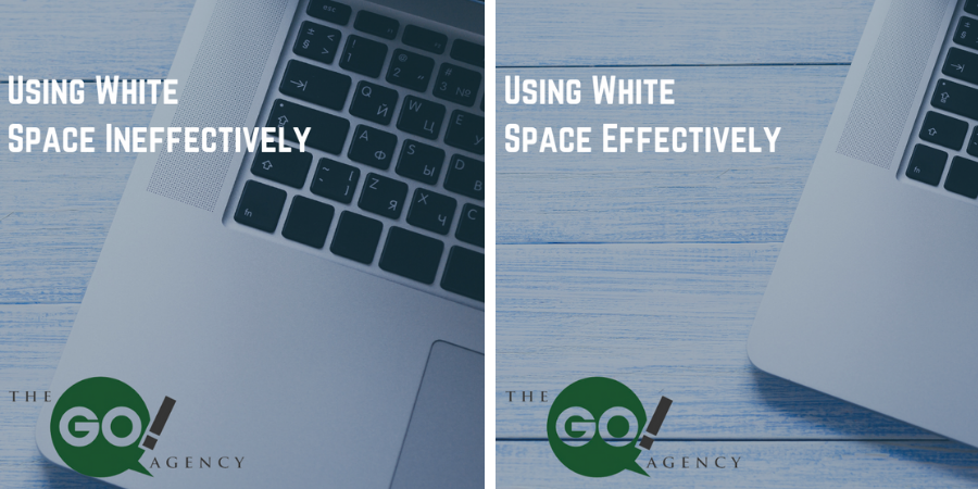
White space is the empty part of a visual that gives it room to breathe. An image that’s crammed full of saturated colors and complicated patterns is going to exhaust anyone looking at it. On the flip side of that, too much white space makes your visual boring!
In this first example, the bad image has way too much white space. It’s boring, empty, and you’re only getting a glimpse of the one object in the image.
But white space is used much more effectively in the second image! It isn’t just a straight shot of the laptop, which would be dull to look at, but it balances the activity on the keyboard with the emptiness of the background and the rest of the laptop.
2. Text Layout
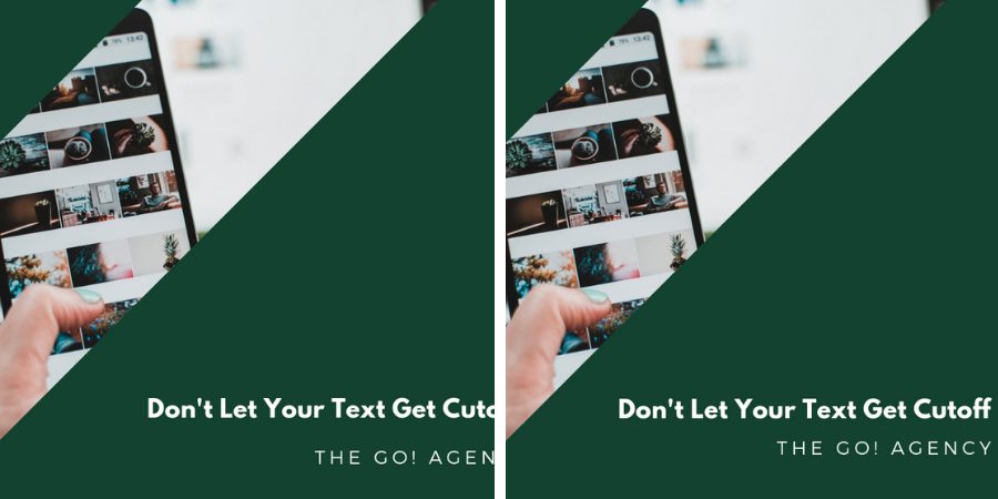
In our first visual, there’s a nice picture presented in an interesting way, but none of that matters once you notice that the text is cutoff. It makes the poster look amateurish, which is never a word you want associated with your brand!
In the second image, the text is in its proper place and you can fully appreciate the image and layout that the graphic designer chose. This visual is much more likely to earn some clicks!
3. Kerning
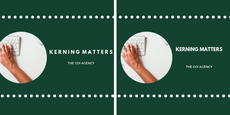
Kerning is the spacing between letters/characters in your visual, and it plays a huge role in how your work is received.
Look at the first design. There’s so much space between the letters that the text is right against the border and the edge of the image is cutoff. As a result, the whole thing looks like a crowded mess.
The second image tightens up the kerning, leaving plenty of room for both the visual and the text. Instead of cramped, this visual feels well-crafted and perfectly spaced!
4. Overcrowding
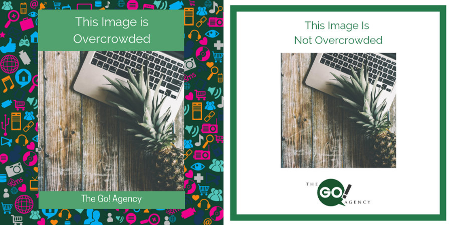
Sometimes, visuals just have too much going on!
The first visual’s funky background makes the entire thing feel too crowded. Your eye isn’t sure where to go, and your social media following would quickly tell you that your visual gave them headaches!
The revised visual is much more pleasant. There’s plenty of empty space, and your eye can much more easily focus on the central image.
5. Legibility
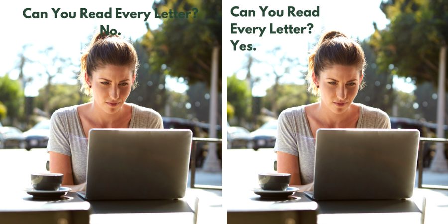
As a graphic designer, you have to carefully pair the color of your font with the image!
The text in the first image is clear—until we lose it in the trees and the woman’s hair. Because the graphic designer didn’t consider how a dark green font would look against leaves, you lose the tail end of the message.
The green text looked great, so our graphic designer fixed this by changing up the spacing. You get a clear, legible visual without sacrificing text that fits the image’s background!
6. Justification
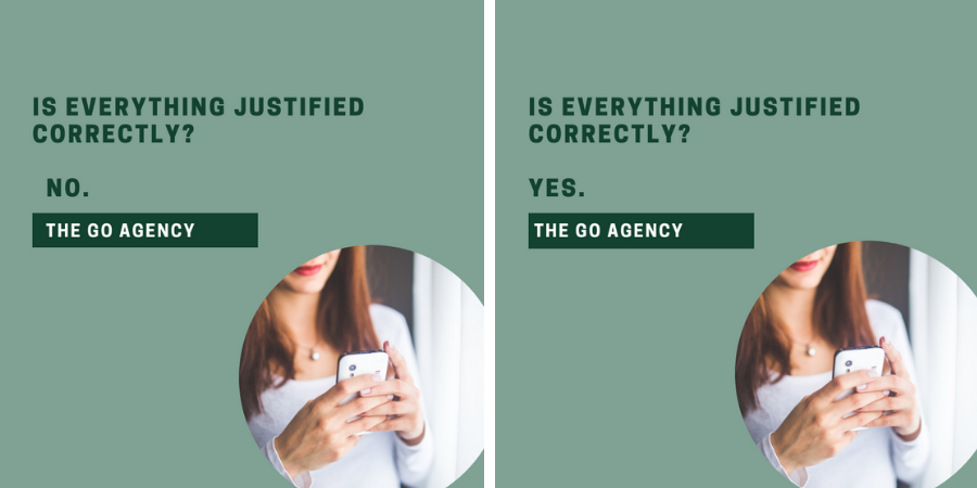
In design, justification is how text/graphic elements are structured. For example, if text is “right justified,” it will all start from the right side of the visual.
This is where we enter the uncanny valley—something looks off, but the reason may not be obvious at first. In our first image, the text is all slightly mis-aligned, with the “No” slightly off from the preceding line of text.
Our second image changes everything to be left justified, and the entire visual is better for it. It looks crisp, orderly, and doesn’t make you scratch your head and wonder, “What’s wrong here?”
Invest In Your Visuals
There are a lot of elements that go into great graphic design, but it’s important that you keep them in mind! You wouldn’t skimp on your written content, and visuals are at least as important!
Could your visual content use some help? Schedule your free consultation with The Go! Agency!
Read More